Simplicity is a virtue not always given its due, especially by Web designers. The number of bells and whistles available to programmers multiplies daily so it's no wonder that Web sites get slicker, busier, and more crowded (but not necessarily better) with each passing minute.
The same could be said for electric guitars. It took 10 years -- most of the '80s -- for an entire generation of musicians to figure out that more notes are not necessarily better. When they finally realized it, the guitar solo had more or less disappeared altogether, as if all the notes had been finally used up. DJs replaced guitar heroes.
Enter, or rather re-enter, Carlos Santana. He's selling millions of copies of the #1 album Supernatural -- with the young guy from Matchbox 20, of all people, singing over his guitar and the congas. Arguably, the late-'60s guitarist/bandleader is able to remain current because he keeps things simple, in his music and on his Web site.
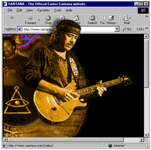
That's not a criticism. Go to Santana.com and you basically find a scrapbook, the sort a fan might put together, straightforward and clear. It's not overly commercial, and it's not overly distracted by technology. Santana doesn't seem to be advertising himself on the site, so he's simply providing a little outpost for his already massive throng of devoted fans. It's a place to find tour dates, discographies, lists of who played what instrument on which record, what sort of guitars and amps Santana uses (geeky, but probably interesting to people who also play), and lyrics (some in Spanish; fantastic if your Spanish isn't quite good enough to follow along on the albums).
Of course, it doesn't look like much. Other than a little montage-picture on top, the home page looks like it was made with a lite bright. The fonts are circa 1995, entirely no-frills, as if the person who put the words onscreen was just happy to get them to line up right.
It's not going to dazzle you with visuals, but perhaps that's not the point. Santana can play his guitar fast, but it's the slow notes you remember, not the flurries. The Web site reflects that: a few good themes, rather than a million cursory images. It works. Fans of the music will appreciate the information, obviously presented and easily accessible. Fans of the site will appreciate the music, which you will hear whether you want to or not, because it's good, and because it is still, amazingly, everywhere.
Marc Herman is a freelance reporter in Alameda, California. His work has appeared in Environmental RegulationandPermitting Quarterly, Platt's Metals Week, and Spin.
Celebrity Web site reviews run each Tuesday on GettingIt.
